
The short answer
Most small-business home pages need the same eight parts, in roughly this order:
- A headline that says what you do and where. Plain words, the town or region, no slogan.
- The main action. One button or phone number: call, get a quote, book, order, donate.
- Proof. Reviews, photos of real work, licenses, years in business, who you've worked for.
- Services, each linking to its own page. A short line on each, not the whole pitch.
- Service area. The towns you cover, linked to town pages if you have them.
- How it works. Three or four steps from first contact to finished job.
- A short FAQ. The four to six questions you get on the phone every week.
- Contact and hours. Phone, email or form, address if customers come to you, and your hours.
That's it. Everything else either belongs on another page or doesn't belong on the site. The order follows the questions a visitor asks in their head: am I in the right place, can they help me, are they any good, do they do my thing, do they come to me, what happens next, what about the things I'm worried about, how do I reach them.
The rest of this guide goes through each part, then what to leave off, then how the page changes for a trade, a contractor, a restaurant, a clinic, a nonprofit and a manufacturer.
The first screen: what you do, where, and how to start
The top of the page, the part someone sees before they scroll, decides whether they stay. On a phone that's a small space, so it has to hold three things and not much else: what you do, where you do it, and the main action.
The headline should be the plainest sentence you can write. Not a slogan. A slogan like "Quality you can trust" could sit on a bakery, a law firm or a roofer. "Kitchen and bathroom remodeling in Buffalo and the west metro" can only sit on one kind of business, and that's the point. It tells the visitor they're in the right place, and it tells Google the same thing.
Worked example: headline rewrites
These are invented examples, but they're the kind of line we see on real sites every week.
- Before: "Your vision, our passion." After: "Custom decks and porches for homes in Maple Grove, Plymouth and Rogers."
- Before: "Welcome to our website!" After: "Plumbing repair and water heaters in Monticello. Same-day service most weekdays."
- Before: "Excellence in every part." After: "Injection-molded plastic parts, short runs to production, made in Minnesota."
Under the headline, one short line can add the detail that matters most to your customer: same-day service, free estimates, accepting new patients, open until 10. Then the main action. A sentence about your values or your history can wait until the about page.
Writing these lines is its own skill. Our guide to website copywriting basics has more before-and-after rewrites and the rules behind them.
The main action: one thing, done well
Pick the one thing you most want a ready visitor to do, and make it the most obvious thing on the page. For most service businesses it's one of three:
- Call. If most of your work starts with a phone call, the number goes at the top, large, as a tap-to-call link. People on phones won't copy a number into their dialer if they can tap it somewhere else.
- Get a quote or estimate. A button that goes to a short form. Ask for what you need to call them back with a real answer, and nothing more. Our guide on booking and quote forms covers what to ask.
- Book. If you sell appointments (a clinic, a salon, a consultation), link straight to the booking page or tool, not to a contact form that says "we'll be in touch."
You can have a second, quieter option next to it, for example "Call" as the main button and "Request a quote" as a text link. What you shouldn't have is four buttons of the same size and color. When everything is the main action, nothing is.
Repeat the main action lower on the page, after the proof and again at the very bottom. Someone who scrolls all the way down has read everything and is deciding; don't make them scroll back up to act.
Proof: the part most home pages are missing
Everyone says they're reliable, honest and fairly priced. Proof is what makes your page different from the next result. Put some of it high on the page, right under the first screen, before the services. Good proof, roughly in order of how much it persuades:
- Reviews from real customers, with a first name and a town, ideally pulled from your Google reviews so people can check them. Two or three short ones beat a wall of twenty.
- Photos of your own work, on real jobs, in real houses. Stock photos read as stock, and people notice. See our guide to website photos.
- Licenses, certifications and insurance, with the number where there is one. A contractor license number or a certification like EPA Lead-Safe says more than "fully qualified".
- Specifics about your business: years in business, jobs completed if you track it, the brands you're certified to install, the kinds of clients you work with.
Review stars with no reviews behind them, "satisfaction guaranteed" badges and awards nobody has heard of don't count. If you can't point to it, leave it off. The full how-to for collecting and showing reviews is in our guide to reviews on your website, and our free Google Review Link Generator makes the link you send customers to leave one.
Services and service area: short, linked, specific
The services section on a home page is a menu, not the meal. List each service with a short line and a link to that service's own page, where the full explanation, photos and questions live. Five services with one sentence each fit on a phone screen or two. Five services explained in full turn the home page into a wall that nobody reads and that ranks for none of them.
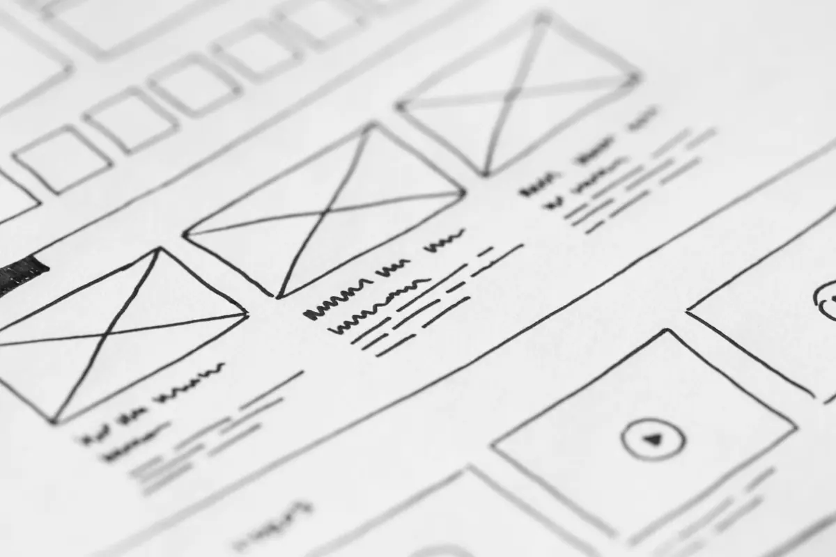
Each service gets its own page because people search for one thing at a time, "water heater replacement" or "basement finishing", and Google matches that search to the page that answers it best. A home page that mentions twelve services in passing is rarely that page. How many pages that adds up to is covered in how many pages a small-business website needs.
Then the service area. Write the towns or region out in plain text: "We work in Buffalo, Monticello, Annandale and the rest of Wright County." A map image is nice to have, but Google and screen readers can't read the towns off it. If you have town pages, link each town name to its page. If you list forty towns, that's fine on a dedicated service area page; on the home page, name the main ones and link to the full list. We explain how to build town pages that actually help in service area pages done right.
How it works, a short FAQ, and contact
How it works
Three or four steps, each a sentence. This section exists to take the worry out of the first call, especially for bigger jobs where people don't know what happens after they fill in a form. "1. Call or send a request. 2. We come out and give you a written price. 3. We schedule the work. 4. We clean up and walk you through it."
A short FAQ
Four to six questions, the ones you answer on the phone every week. Do you charge for estimates? How soon can you come out? Do you take insurance? Roughly what does it cost? Answer each in two or three sentences. A longer FAQ belongs on its own page. If you mark the questions up with FAQ schema, search engines can read them as questions and answers; our free FAQ Schema Generator writes the code.
Contact and hours
The bottom of the page closes the loop: phone number, a short form or a link to one, email if you answer it, your address if customers come to you, and your hours. Make the hours and phone number match your Google Business Profile exactly, because Google compares them and customers notice when they don't match. If you're a service-area business that doesn't take visitors, you don't need to show a street address; the towns you serve do the same job.
Two real home pages, and why they're built that way
Two sites we built show the same rules applied to very different businesses.
Rescue Network is a foster-based dog and cat rescue in Buffalo. People arrive wanting very different things: to adopt, to foster or volunteer, to donate, to find out who runs it, to come to an event, or to find help with a pet. So the home page opens with six numbered entry points: Adopt, Get Involved, Ways to Support, Who We Are, Events and Resources. Each one sends the visitor down a separate path instead of making everyone read the same page. For a nonprofit, the "main action" is often two or three actions, and that's fine as long as each one is clear. See the Rescue Network case study.
MDR is a design-build remodeler in Farmington. Its home page is the short version of the whole pitch: the five services, why homeowners choose MDR, the four-step process (Consult, Design, Build, Enjoy), Google reviews, an FAQ and the list of towns it serves. Every one of those sections links to a deeper page: a page per service, galleries by room, city pages, a guide library. The home page doesn't try to say everything. It says enough to get the visitor to the right next page. See the MDR case study.
What to leave off
Most weak home pages aren't missing much. They're carrying things that push the useful parts down the page. Take these off:
- Sliders and rotating banners. They change before people finish reading, they hide every message but the first, and they're often slow to load on a phone. Pick your best message and show it, still.
- Video that autoplays with sound. It annoys almost everyone, and most browsers block it anyway. A short video people choose to play is fine, lower on the page.
- Walls of text. A home page is for scanning. If a paragraph runs past four or five lines, it probably belongs on the about page or a service page.
- Stock "team" photos of strangers. Smiling people in hard hats who don't work for you undo the trust the rest of the page builds. Use your real team, your real trucks, or no people at all.
- Every service in detail. Link to the service pages instead.
- "Welcome to our website." The visitor knows. Use the line for what you do.
- Pop-ups on arrival. A newsletter box before someone has read a word mostly gets closed.
How the home page changes by business
The eight parts stay the same. What changes is the main action and which proof goes first.
| Business type | Main action | Proof that matters most | Also put near the top |
|---|---|---|---|
| On-demand trade (plumber, electrician, HVAC repair) | Tap to call, big | Reviews, license number, how fast you come out | Hours, and whether you take emergency calls |
| Bid-in-advance contractor (remodeler, builder, landscaper) | Request a consultation or estimate | Photos of finished projects, the process, license and insurance | Service area, and what a project typically involves |
| Restaurant | View the menu, order or reserve | Food photos you took, reviews | Hours, address, parking, today's specials if you run them |
| Clinic (dental, medical, therapy) | Book an appointment or call | Provider names and credentials, reviews | Insurance you take, new patient info, hours |
| Nonprofit | The two or three things people come to do (donate, adopt, volunteer) | Real outcomes, photos of your own work | How to give, and what a gift does |
| Manufacturer | Request a quote, ideally with file upload | Capabilities, certifications you hold, industries served | Processes, materials, tolerances or sizes you work in |
These are starting points. If your phone rings more than your form fills, make the phone number the main action, whatever kind of business you are.
A few notes on each:
- On-demand trades are mostly visited by someone with a problem right now. Phone number first, hours next to it, reviews right below. See web design for home services.
- Bid-in-advance contractors are being compared over weeks. Finished project photos and a clear process carry more weight than speed. See web design for remodelers and web design for contractors.
- Restaurants need the menu as real text on the page, not only a PDF, plus hours and location right at the top. Most visitors want one of those three things. See restaurant web design.
- Clinics get asked about insurance and new patients more than anything else, so answer both on the home page. See medical and dental web design.
- Nonprofits often have two or three audiences (people who need help, people who give, people who volunteer), so separate paths, as Rescue Network does, work well. See nonprofit web design and our guide to donation pages.
- Manufacturers are visited by engineers and buyers checking whether you can make their part. Capabilities, processes and a quote request that takes a drawing file do more than a mission statement. See manufacturing web design.
Section by section, in one table
Here's the whole page in one place: what each section is for, what goes in it, and the mistake we see most often.
| Section | Its job | What goes in it | Common mistake |
|---|---|---|---|
| Headline | Tell a stranger they're in the right place | What you do, where, and for whom, in one line | A slogan that could belong to anyone |
| Main action | Give the ready visitor a way to start | One button or a tap-to-call number, repeated lower down | Four buttons that all look equally important |
| Proof | Make the claim believable | Real reviews with names, real job photos, license numbers, certifications | Anonymous quotes and stock photos |
| Services | Send each visitor to the page for their problem | Each service with one line and a link to its own page | Every service explained in full on the home page |
| Service area | Answer "do you come to me?" | Towns or a region, linked to town pages | No towns at all, or a list of 80 |
| How it works | Take the fear out of the first call | Three or four steps, each one sentence | A paragraph about your philosophy |
| Short FAQ | Answer the questions that stop people calling | Price ranges, timing, what areas, what to expect | Questions nobody asks |
| Contact and hours | Close the loop for people who scrolled to the bottom | Phone, form, hours, address if you have a storefront | A form with twelve fields and no phone number |
The order matters most at the top. Below the services, you can swap sections around to suit your business.
Worked example: a home page for a small plumbing company
An invented example: a two-truck plumbing company in Delano that mostly takes repair calls and some water heater installs. Section by section, its home page could be:
- Headline: "Plumbing repair and water heaters in Delano, Montrose and Rockford." Under it: "Licensed, insured, and usually there the same day." Then a large tap-to-call button and a smaller "Request a visit" link.
- Proof: three Google reviews with first names and towns, and the plumbing license number.
- Services: repairs, drain cleaning, water heaters, fixtures, each with one line and a link to its page.
- Service area: the towns written out, each linked to its town page.
- How it works: call, we come out and give you a price before we start, we fix it, we clean up.
- FAQ: do you charge to come out, do you work weekends, roughly what a water heater costs, do you do new construction.
- Contact and hours: the same phone number again, a short form, weekday and Saturday hours that match the Google profile.
That page is short. It would fit in about six phone screens, and every section earns its place.
A checklist for your own home page
Open your home page on your phone, not your computer, and go down this list.
Test your home page against this
- Someone who has never heard of you can say what you do and where within five seconds of the page loading.
- The main action is visible on a phone without scrolling, and the phone number is a tap-to-call link.
- There is at least one piece of proof above the services: a review, a real photo or a license number.
- Every service on the home page links to its own page.
- The towns or region you serve are written out in plain text, not only on a map image.
- How it works fits in three or four short steps.
- The FAQ answers questions you actually get, including roughly what things cost.
- Hours, phone and address match your Google Business Profile exactly.
- No slider, no autoplaying video with sound, no stock photos of people pretending to be your team.
- The main action appears again at the bottom of the page.
- The page loads fast on a phone on cellular data, not only on your office Wi-Fi.
If you're failing more than three of these, the page is probably due for a rework rather than a patch. Our free Website Redesign Scorecard helps you decide which.
When we build a site, the home page is the first thing we design. Before the second half of the build fee is due, we show you the home page and one key inner page, and if you don't like the direction, the deposit comes back in full. You can see how that works on our pricing page, or read more about how we design and build sites. We work with businesses from Buffalo to Delano and across central Minnesota.
Want a straight answer for your business?
Every Stonekept build is custom-coded, hosted on Cloudflare and kept on a monthly plan. Prices are public: builds from $2,200 with care from $199/mo. See pricing or tell us about your project and we'll give you an honest read, even if that's not us.